
Responsive design is a cornerstone of modern web development, ensuring that your application adapts gracefully to various screen sizes. In this comprehensive guide, we’ll explore how to achieve easy and reactive access to the width and height of your screen using Vue.js. Leveraging Vue.js reactivity, we’ll create a simple yet powerful solution that allows your application to seamlessly respond to changes in screen dimensions.
Introduction to Vue.js and Screen Dimensions
Vue.js is a JavaScript framework renowned for its simplicity and reactivity. By integrating Vue.js into your project, you gain the ability to create dynamic and responsive user interfaces. In this guide, we’ll focus on utilizing Vue.js to obtain real-time access to the width and height of the screen, enabling you to tailor your application’s layout accordingly.
Setting Up the Vue.js Project
Begin by setting up a new Vue.js project using the Vue CLI:
vue create vue-screen-dimensions
Navigate to the project directory:
cd vue-screen-dimensions
Creating the ScreenDimensions Component
Create a modular Vue component, named ScreenDimensions.vue, to encapsulate the functionality of accessing screen dimensions:
<!-- ScreenDimensions.vue -->
<template>
  <div class="screen-dimensions">
    <p>Screen Width: {{ screenWidth }}px</p>
    <p>Screen Height: {{ screenHeight }}px</p>
  </div>
</template>

<script>
export default {
  data() {
    return {
      screenWidth: window.innerWidth,
      screenHeight: window.innerHeight,
    };
  },
  mounted() {
    window.addEventListener('resize', this.handleResize);
  },
  beforeDestroy() {
    window.removeEventListener('resize', this.handleResize);
  },
  methods: {
    handleResize() {
      this.screenWidth = window.innerWidth;
      this.screenHeight = window.innerHeight;
    },
  },
};
</script>

<style scoped>
/* Component-specific styles here */
.screen-dimensions {
  text-align: center;
  margin: 20px;
  padding: 20px;
  border: 1px solid #ccc;
  border-radius: 5px;
  background-color: #f8f8f8;
}
</style>
This component displays the current screen width and height, and it dynamically updates these values when the screen is resized.
Incorporating the ScreenDimensions Component
Integrate the ScreenDimensions component into your main application file (e.g., App.vue):
<!-- App.vue -->
<template>
  <div id="app">
    <ScreenDimensions />
  </div>
</template>

<script>
import ScreenDimensions from './components/ScreenDimensions.vue';

export default {
  components: {
    ScreenDimensions,
  },
};
</script>

<style>
/* Global styles here */
body {
  margin: 0;
  font-family: 'Arial', sans-serif;
  background-color: #f4f4f4;
}

#app {
  text-align: center;
  padding: 20px;
}
</style>
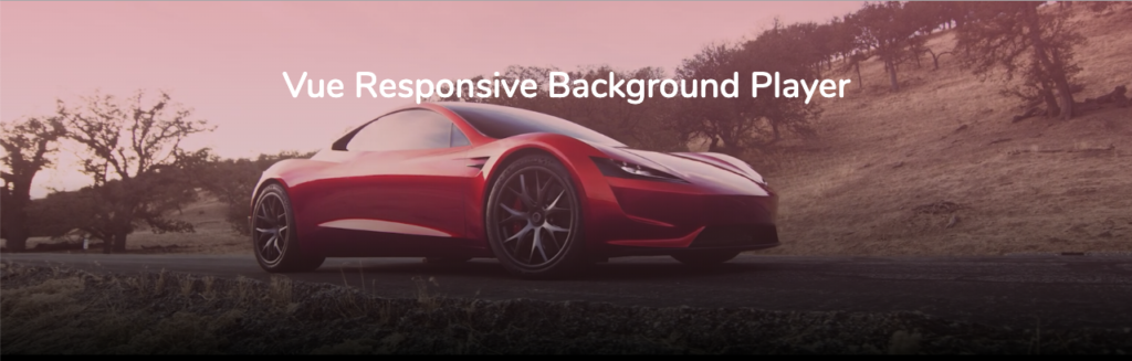
If you are want to play videos in the background then use this simple Vue.js package
Follow these steps to use it
Installation in 2 Steps
1: Add with npm 💻
 # For Vue 2.x.x
 npm install [email protected]

# For Vue 3.x.x
 npm install vue-responsive-video-background-player
2a: Install as a component
 import VideoBackground from 'vue-responsive-video-background-player'

 Vue.component('video-background', VideoBackground);
2b: Install as a plugin
 import { Plugin } from 'vue-responsive-video-background-player'

 Vue.use(Plugin);
(3: Only for Nuxt.js users)
Again this is only for Nuxt.js users. Gridsome users click here. At your nuxt.config.js locate the part where you declare your plugins and import the file. Example:
plugins: [
  {
    src: '~/plugins/vue-video-background',
    ssr: false
  }
]
Now the component is globally available and can be used at any .vue file without issues.
Usage – (or to make it runnable 🏃♂️)
Easiest version 🔍
 <video-background
    src="<your-video-path>.mp4"
    style="max-height: 400px; height: 100vh;"
 >
    <h1 style="color: white;">Hello welcome!</h1>
 </video-background>
Advanced version 🌐
 <video-background
    src="<your-default-video-path>.mp4"
    poster="/images/mainfoto.jpg"
    :sources="[
        {src: '<your-tablet-video-path>.mp4', res: 900, autoplay: true},
        {src: '<your-mobile-video-path>.mp4', res: 638, autoplay: true, poster: '<your-mobile-background-image-path>.png'}
    ]"
    style="max-height: 400px; height: 100vh;"
    overlay="linear-gradient(45deg,#2a4ae430,#fb949e6b)"
>
    <h1 style="color: white;">Hallo welcome!</h1>
</video-background>
Demo ⚡️
Props
Props values
src(required:true)
This is your path to your video. You can just use this value for showing your video in every resolution.
poster(default:'')
This is your first background image that is shown before the video is loaded.
sources(default:[])
This is the main reason for this package. I wanted to have the possibility to change the resolution of the video when the resize event is fired.
To make it work, sources is an array that contains objects. For example:
[{src: '<your-mobile-video-path>.mp4', res: 638, autoplay: true, poster: '<your-mobile-background-image-path>.png'}]
To make it work you need at least src, res, autoplay.
poster is optional.
res stand for resolution. This example means that between 0px and 638px of the window’s width only the mobile video will be shown. After that your default src.
autoplay(default:true)
The video is going to be played immediately when the video is ready. If you are setting it to false, you can start the video just by this.$refs.videobackground.player.play(). But remember to set ref=videobackground to the HTML tag <video-background>, so that it can work.
overlay(default:'') If you love overlays, then copy the overlay from the advanced example.muted(default:true)
Warning. Videos are perhaps not played when unmuted.
loop(default:true)
Loops through the video. You can catch the event ended to show only the poster.
preload(default:auto)
objectFit(default:cover)
So the video fits perfectly in the container
playsWhen(default:canplay)
This is important, if you know that you might have users with bad internet speed, you should definetly use canplaythrough.
playbackRate(default:1.0)
The playbackRate property sets the current playback speed of the video.
transition(default:fade)
You can add your own transition styles here. If you set it to empty string, it won’t show any transitions.
Events
ready: Video is loadedplaying: Video is playingerror: Video errorloading: Video is loadingended: Video finished, only whenloopis set to false
Methods
If you happen to need more control over the player, you can use the internal methods. For that, you need to set ref=videobackground to the HTML tag <video-background>. After that you can call all methods like this this.$refs.videobackground.player.play().
play(): Video is playingpause(): Video is pausedshow(): Video is shownhide(): Video is hidden, the poster is shownload(): Video is loaded