
Progress bars are a fundamental element in user interfaces, providing visual feedback on the completion status of tasks. In this comprehensive guide, we’ll delve into creating a Vue.js progress bar, exploring various techniques to enhance its functionality and appearance. Whether you’re tracking file uploads, form submissions, or any other asynchronous operation, mastering progress bars in Vue.js will empower you to deliver a polished and user-friendly experience.
Introduction to Vue.js and Progress Bars
Vue.js is a progressive JavaScript framework known for its simplicity and reactivity. When it comes to creating dynamic user interfaces, Vue.js offers an ideal environment for building components like progress bars. In this guide, we’ll harness the power of Vue.js to craft a versatile and customizable progress bar.
Setting Up the Vue.js Project
Start by setting up a new Vue.js project using the Vue CLI:
vue create vue-progress-bar
Navigate to the project directory:
cd vue-progress-bar
Building the Basic Progress Bar Component
Create a modular Vue component to encapsulate the basic structure and functionality of a progress bar. Let’s name it ProgressBar.vue:
<!-- ProgressBar.vue -->
<template>
  <div class="progress-bar">
    <div class="progress" :style="{ width: `${progress}%` }"></div>
  </div>
</template>

<script>
export default {
  props: {
    progress: {
      type: Number,
      required: true,
    },
  },
};
</script>

<style scoped>
/* Component-specific styles here */
.progress-bar {
  width: 100%;
  height: 20px;
  background-color: #e0e0e0;
  border-radius: 4px;
  overflow: hidden;
}

.progress {
  height: 100%;
  background-color: #4caf50;
  transition: width 0.3s ease-in-out;
}
</style>
This basic ProgressBar component includes a container with a background color and a child element representing the progress. The width of the progress element is dynamically adjusted based on the progress prop.
Using the Progress Bar in Your App
Integrate the ProgressBar component into your main application file (e.g., App.vue):
<!-- App.vue -->
<template>
  <div id="app">
    <ProgressBar :progress="uploadProgress" />
    <button @click="simulateFileUpload">Simulate File Upload</button>
  </div>
</template>

<script>
import ProgressBar from './components/ProgressBar.vue';

export default {
  components: {
    ProgressBar,
  },
  data() {
    return {
      uploadProgress: 0,
    };
  },
  methods: {
    simulateFileUpload() {
      // Simulate a file upload process
      const interval = setInterval(() => {
        this.uploadProgress += 10;
        if (this.uploadProgress >= 100) {
          clearInterval(interval);
          this.uploadProgress = 0;
        }
      }, 500);
    },
  },
};
</script>

<style>
/* Global styles here */
body {
  margin: 0;
  font-family: 'Arial', sans-serif;
  background-color: #f4f4f4;
}

#app {
  text-align: center;
  padding: 20px;
}

button {
  padding: 10px;
  font-size: 16px;
  margin-top: 20px;
}
</style>
In this example, the ProgressBar component is utilized to visualize the progress of a simulated file upload. The simulateFileUpload method increments the uploadProgress data property, triggering the progress bar to update accordingly.
Enhancing Progress Bar Functionality
Adding Animation
You can enhance the progress bar by adding a smooth animation effect to the progress changes. Update the ProgressBar component styles:
/* ProgressBar.vue */
.progress {
  height: 100%;
  background-color: #4caf50;
  transition: width 0.3s ease-in-out, background-color 0.3s ease-in-out;
}
Customizing Colors
Allow users to customize the colors of the progress bar by adding color props to the ProgressBar component:
<!-- ProgressBar.vue -->
<template>
  <div class="progress-bar">
    <div class="progress" :style="{ width: `${progress}%`, backgroundColor: barColor, borderColor: borderColor }"></div>
  </div>
</template>

<script>
export default {
  props: {
    progress: {
      type: Number,
      required: true,
    },
    barColor: {
      type: String,
      default: '#4caf50', // Default color: green
    },
    borderColor: {
      type: String,
      default: '#e0e0e0', // Default color: light gray
    },
  },
};
</script>

<style scoped>
/* Component-specific styles here */
.progress-bar {
  width: 100%;
  height: 20px;
  background-color: #e0e0e0;
  border-radius: 4px;
  overflow: hidden;
  border: 1px solid #e0e0e0; /* New border style */
}

.progress {
  height: 100%;
  transition: width 0.3s ease-in-out, background-color 0.3s ease-in-out, border-color 0.3s ease-in-out; /* Updated transition */
}
</style>
Now, users can customize the barColor and borderColor properties when using the ProgressBar component.
if you want to use ProgressBar using vue.js SVG/Vector based 4 modes: Line, Circle, Cylinder and Battery then use this component in your Vue.js
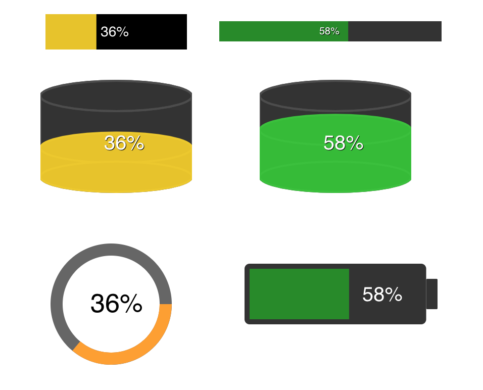
There are following steps to use Vue.js progressbar
Setup
install:
npm install vuejs-progress-bar --save
Import: (in your main.js)
import ProgressBar from 'vuejs-progress-bar'
Vue.use(ProgressBar)
Usage
Use: (in your local .vue file/component, html section)
<progress-bar
  :options="options"
  :value="value"
/>

<!-- Options struct: -->
options: {
  text: {
    color: '#FFFFFF',
    shadowEnable: true,
    shadowColor: '#000000',
    fontSize: 14,
    fontFamily: 'Helvetica',
    dynamicPosition: false,
    hideText: false
  },
  progress: {
    color: '#2dbd2d',
    backgroundColor: '#333333',
    inverted: false
  },
  layout: {
    height: 35,
    width: 140,
    verticalTextAlign: 61,
    horizontalTextAlign: 43,
    zeroOffset: 0,
    strokeWidth: 30,
    progressPadding: 0,
    type: 'line'
  }
}
Properties
| Name | Type | Default | Description |
|---|---|---|---|
| value | Number | 0 | Value of progressbar % |
| color | String | #FFFFFF | Text color |
| shadowEnable | String | true | Text shadow enable |
| shadowColor | String | #000000 | Text shadow color |
| hideText | Boolean | false | Hide text (%) |
| fontSize | String | 14px | Font size of % text |
| fontFamily | String | Helvetica | Font family text |
| dynamicPosition | Boolean | false | Progress text % follow progress bar |
| color | String | #2dbd2d | Progress color, use hex or rgb |
| backgroundColor | String | #C0C0C0 | Background color, use hex or rgb |
| inverted | Boolean | false | Invert circle progress |
| width | Number | 140 | Width |
| height | Number | 35 | Height, use strok for progress height |
| verticalTextAlign | Number | 61 | Positioning of % text vertical |
| horizontalTextAlign | Number | 43 | Positioning of % text horizontal |
| zeroOffset | Number | 0 | Offset for zero (0%) for line progress bar |
| strokeWidth | Number | 30 | Width of background of progress |
| progressPadding | Number | 0 | Padding between background and progress bar (line only) |
| type | String | line | type of progress bar: line, circle, cylinder or battery |
Update package:
- Compile and build for production
npm run build
- check into git
git add .
git commit -m "Message.."
- Publish to NPM
# Do some work...

# x.x.1 -> x.x.2
npm version patch

# x.1.0 -> x.2.0
npm version minor

# 1.0.0 -> 2.0.0
npm version major