
Date range pickers are crucial components in web applications, allowing users to select a range of dates efficiently. In this detailed guide, we’ll explore the process of creating a Material Design-inspired Vue.js date range picker. By the end of this tutorial, you’ll have a user-friendly and visually appealing date range picker that follows the Material Design guidelines.
Setting Up the Vue Project:
Begin by creating a new Vue project using the Vue CLI. If you haven’t installed it, run:
npm install -g @vue/cli
vue create material-date-range-picker
cd material-date-range-picker
Installing Dependencies:
Install the vue-material library to utilize Material Design components:
npm install vue-material
Designing the MaterialDateRangePicker Component:
- Configure Vue Material in
main.js
import Vue from 'vue';
import VueMaterial from 'vue-material';
import 'vue-material/dist/vue-material.min.css';
import 'vue-material/dist/theme/default.css';

Vue.use(VueMaterial);

import App from './App.vue';

new Vue({
  render: h => h(App),
}).$mount('#app');
- Create a
MaterialDateRangePicker.vuecomponent:
<template>
  <md-field>
    <label>Select Date Range</label>
    <md-date-picker
      v-model="dateRange"
      :md-options="datePickerOptions"
      @md-opened="setDateRange"
    ></md-date-picker>
  </md-field>
</template>

<script>
export default {
  data() {
    return {
      dateRange: {
        start: null,
        end: null,
      },
      datePickerOptions: {
        format: 'MM/dd/yyyy',
        defaultView: 'date',
        views: ['date', 'year'],
      },
    };
  },
  methods: {
    setDateRange() {
      // Logic to set the date range
    },
  },
};
</script>

<style scoped>
/* Add custom styling as needed */
</style>
Using the MaterialDateRangePicker Component in App.vue:
- Update the
App.vuecomponent:
<template>
  <div id="app">
    <MaterialDateRangePicker />
  </div>
</template>

<script>
import MaterialDateRangePicker from './components/MaterialDateRangePicker.vue';

export default {
  components: {
    MaterialDateRangePicker,
  },
};
</script>

<style>
#app {
  display: flex;
  justify-content: center;
  align-items: center;
  height: 100vh;
  background-color: #ecf0f1;
  margin: 0;
}
</style>
Explanation of the MaterialDateRangePicker Component:
- The
MaterialDateRangePicker.vuecomponent utilizes themd-date-pickercomponent fromvue-materialto create a Material Design-inspired date range picker. - The
dateRangedata property stores the selected date range. - The
datePickerOptionsobject configures the date picker’s format, default view, and available views. - The
setDateRangemethod can be extended to handle logic when the date range is selected.
Running the Application:
Run the following commands to see the Material Design date range picker in action:
npm install
npm run serve
Visit http://localhost:8080 in your browser to interact with the Material Design-inspired Vue.js date range picker.
You can implement material vue.js dater range picker in your vue.js app
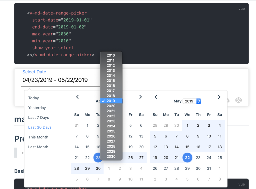
Installation
npm install v-md-date-range-picker --save

# or use yarn
yarn add v-md-date-range-picker
Quick Start
you can use vue-cli to create project
1. npm install -g @vue/cli # or yarn global add @vue/cli
2. vue create hello-world
 <!-- App.js -->
<template>
  <v-md-date-range-picker></v-md-date-range-picker>
</template>
// main.js
<script>
import Vue from 'vue';
import VMdDateRangePicker from "v-md-date-range-picker";

Vue.use(VMdDateRangePicker);
</script>