
A 360° product viewer is a captivating feature that allows users to explore a product from every angle. In this detailed guide, we’ll embark on the journey of creating a simple and beautiful 360° product viewer using Vue.js. Leveraging the power of Vue.js and CSS, we’ll build an interactive and visually appealing component that can be seamlessly integrated into your e-commerce or product showcase websites.
Introduction to Vue.js
Vue.js is a progressive JavaScript framework designed for building user interfaces. Its simplicity and flexibility make it an excellent choice for creating dynamic and interactive components. In this project, we’ll utilize Vue.js to manage the state and logic of our 360° product viewer.
Setting Up the Vue.js Project
Start by initializing a new Vue.js project using the Vue CLI:
vue create vue-360-product-viewer
Navigate to the project directory:
cd vue-360-product-viewer
Install any additional dependencies you might need during the project, such as Vue CLI Service for development:
npm install @vue/cli-service --save
Designing the 360° Product Viewer Component
Create a modular structure for the 360° product viewer component. For simplicity, let’s name it ProductViewer.vue:
<!-- ProductViewer.vue -->
<template>
  <div class="product-viewer">
    <div class="viewer-container">
      <img
        v-for="(image, index) in images"
        :src="image"
        :key="index"
        :class="{ 'active': index === currentImage }"
        class="viewer-image"
        @load="handleImageLoad"
      />
    </div>
    <div class="controls">
      <button @click="prevImage" :disabled="isDisabled('prev')">Prev</button>
      <button @click="nextImage" :disabled="isDisabled('next')">Next</button>
    </div>
  </div>
</template>

<script>
export default {
  data() {
    return {
      images: [], // Array of image URLs
      currentImage: 0,
      isLoading: true,
    };
  },
  methods: {
    prevImage() {
      if (!this.isDisabled('prev')) {
        this.currentImage--;
      }
    },
    nextImage() {
      if (!this.isDisabled('next')) {
        this.currentImage++;
      }
    },
    isDisabled(direction) {
      return (
        (direction === 'prev' && this.currentImage === 0) ||
        (direction === 'next' && this.currentImage === this.images.length - 1)
      );
    },
    handleImageLoad() {
      this.isLoading = false;
    },
  },
};
</script>

<style scoped>
/* Component-specific styles here */
.product-viewer {
  display: flex;
  flex-direction: column;
  align-items: center;
}

.viewer-container {
  position: relative;
  overflow: hidden;
  width: 400px; /* Set the width of your viewer */
  height: 300px; /* Set the height of your viewer */
}

.viewer-image {
  width: 100%;
  height: auto;
  transition: opacity 0.3s ease-in-out;
  position: absolute;
  opacity: 0;
}

.viewer-image.active {
  opacity: 1;
}

.controls {
  margin-top: 10px;
}

button {
  padding: 10px;
  margin: 0 5px;
  cursor: pointer;
}

button:disabled {
  opacity: 0.5;
  cursor: not-allowed;
}
</style>
This ProductViewer component includes a container for the images, navigation controls for previous and next images, and a loading indicator. The images array will contain the URLs of your product images.
Incorporating the Product Viewer into Your App
Integrate the ProductViewer component into your main application file (e.g., App.vue):
<!-- App.vue -->
<template>
  <div id="app">
    <ProductViewer :images="productImages" />
  </div>
</template>

<script>
import ProductViewer from './components/ProductViewer.vue';

export default {
  components: {
    ProductViewer,
  },
  data() {
    return {
      productImages: [
        'path/to/image1.jpg',
        'path/to/image2.jpg',
        'path/to/image3.jpg',
        // Add more image URLs as needed
      ],
    };
  },
};
</script>

<style>
/* Global styles here */
body {
  margin: 0;
  font-family: 'Arial', sans-serif;
  background-color: #f8f8f8;
}

#app {
  text-align: center;
  padding: 20px;
}
</style>
Replace the sample image URLs in the productImages array with the URLs of your own product images.
Vue.js library to built A Simple and Beautiful 360° Product Viewer
Features
- 360° View
- Zoom
- Pan
- Autoplay (Loops)
- Full Screen Mode
- Spin Direction
- Image Caching
- Mobile Responsive
- Touch Events
Installation
npm install vue-360
Config
import VueThreeSixty from 'vue-360'

import 'vue-360/dist/css/style.css'

Vue.use(VueThreeSixty)
Example
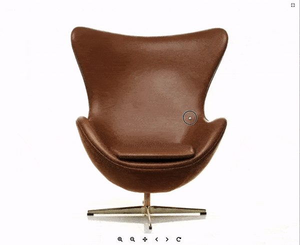
<vue-three-sixty
  :amount=36
  imagePath="https://scaleflex.cloudimg.io/width/600/q35/https://scaleflex.ultrafast.io/https://scaleflex.airstore.io/demo/chair-360-36"
  fileName="chair_{index}.jpg?v1"
/>
Adding a Header
<template v-slot:header>
  <div class="v360-header text-light bg-dark">
      <span class="v360-header-title">36 Images - Autoplay (1 loop) - Reverse Spin</span>
      <span class="v360-header-description"></span>
  </div>
</template>
Icons
- The icons used in the demo are from fontawesome. Add the following in your header to display the icons.
<link href="https://cdnjs.cloudflare.com/ajax/libs/font-awesome/5.11.2/css/all.min.css" rel="stylesheet" type="text/css">
Props
| Name | Type | Description | Required | Default Value |
|---|---|---|---|---|
| amount | Number | Number of images | Yes | |
| imagePath | String | Path to your image | Yes | |
| fileName | String | File name format | Yes | |
| spinReverse | Boolean | Reverse Spin | Optional | false |
| autoplay | Number | Autoplay your images | Optional | 24 |
| loop | Number | Number of loops you want to autoplay | Optional | 1 |
| boxShadow | Boolean | Apply Box Shadow Background | Optional | false |
| buttonClass | String | Apply Styling to Buttons | Optional (light/dark) | light |
| paddingIndex | Boolean | Apply Leading Zero to Image Index | Optional | false |
| disableZoom | Boolean | Disable Zoom Functionality | Optional | false |
| scrollImage | Boolean | Scroll Images instead of Default Zoom | Optional | false |
Buttons
(In order from left to right)
- Play/Pause
- Zoom In
- Zoom Out
- Pan / 360° Mode
- Move Left
- Move Right
- Reset Position
Roadmap
- Hotspots
- Lazyloading
- Custom CSS Classes
- Custom Buttons
- And a few more